Did the course creation page get a facelift?
Why yes, it did, thank you for noticing! We have tried to make the course creation process a little easier for everyone.

MobileMind has revamped its course creation page to provide a more intuitive and user-friendly experience. This article will highlight the new look and feel, showcasing how it simplifies the process of building engaging learning content.
A Focus on User Experience
The redesigned course creation page prioritizes user experience by incorporating the following enhancements:
- Simplified Interface: The layout is streamlined, with clear menus and easy-to-locate functionalities. This reduces clutter and allows you to focus on crafting your course content.
- Intuitive Workflows: The process of adding modules, lessons, and assessments now follows a logical flow, guiding you through each step effortlessly.
- Visual Hierarchy: Important elements like course titles, descriptions, and progress indicators are prominently displayed for better organization and clarity.
Course Information Page
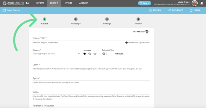
You will first notice the navigation points at the top of the page. The navigation icons are all clickable and you will see a green checkmark when that section is complete.

Choose your category, level, and estimated time it will take to complete this course.

Fill out the Learn and Apply section and paste the link to your video.
Make sure that if you are using a YouTube video that you use the link from the URL address bar and NOT the link you get when you click Share.

Add any additional resources you have and any tags that you would like to use and then click Next.

Course Challenge Page
You will now see the green checkmark for the course page and the Challenge page is now green and ready for you to enter your challenge information.

Choose your submission type.
Remember to consider the number of reviewers you have available if you are going to choose any of the manually reviewed types.

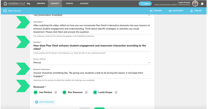
Add the instructions, the question, and the answer options for the learner. Make sure to select a correct answer.
- For Instructions, try to be as specific as possible and add numbers if needed.
- If you would like to allow more than one correct answer, simply select them and choose if you will allow any or if they need to select all the correct answers.
- If you are using multiple choice, you can add a hint that they will receive if they get the answer wrong on the first attempt. (Optional)


For Quizzes, you can add as many questions as you would like. You can also choose to show missed and/or correct answers and choose the score it takes to pass.


For manually reviewed submissions, you will enter the instructions, the question, reviewers instructions, and you will select who will be reviewing these submissions.

Course Settings Page
You will now see green check marks for the Course Information, and the Challenge pages and the circle about the Settings tab is green and ready for you to make your selections.
This is where you will have the following options:
- Related courses
- Exclude from the library
- Release Date
- Group Visibility (Leaving this blank makes it visible to the entire district.)
- Support email (Please make sure this is an email to someone in your district and not MobileMind.)

Course Review Page
Now it's time to check your work before clicking Publish! All your other pages have a green checkmark and it is time to review your course.
If anything is missing from any of the pages you will see a red exclamation point about that page title.


Save, Publish, and Share!

If you are ready to publish, please consider sharing your course with the MobileMind Community. We have more than 500 courses in there already that you are welcome to copy and use for your own district!

